The Man of Steam! Inc.
Steam Cleaning Company
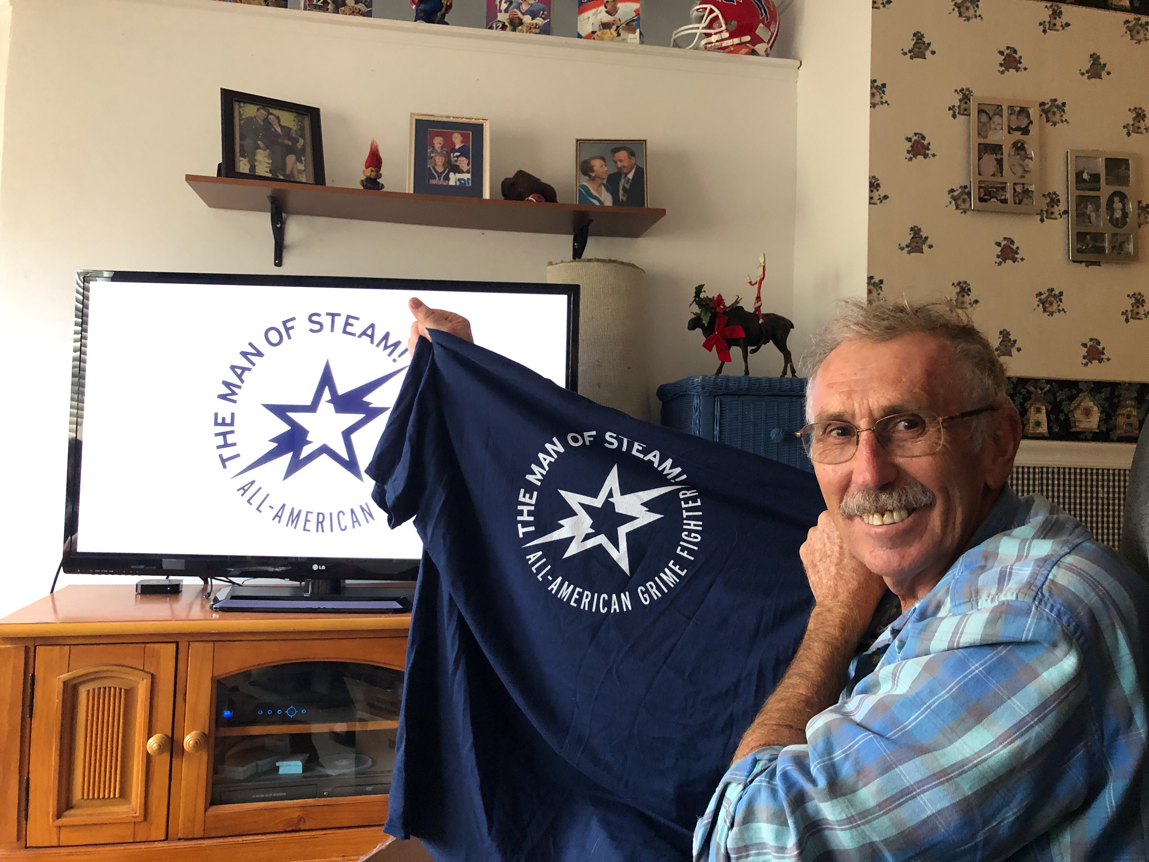
A star and a lightning bolt, simple and bold. They've been the symbol of The Man of Steam! for over 35 years. It was the honor of my life to re-imagine the logo for my father's business. Throughout the decades there have been several iterations of the logo and it was my goal to capture the essence of them all in a clean and iconic mark.
Chill Phil's Creamery
Small Batch Craft Creamery
Phil is a gourmet chef who stumbled into Ice Cream making during the middle of the pandemic. It was his vision to sell home made ice cream in small batches with interesting flavors like guava and cheese, mojito mint and cream and praline pretzel dulce de leche. Phil wanted a logo that would be fun, recognizable and have a retro vibe to inspire consumer confidence in his new product.


Community Curations
Transformative Event Organization
Community Curations is a company that creates connections through events, education and community engagement. The goal for this logo and branding set was to create a colorful, high contrast mark that included connected double Cs. Using a circle a container and implied shape, the brand mark has friendly round features with a strong interlocking square connecting the Cs.
Alternate logos
EduPaaS Consulting
Salesforce Consulting Firm
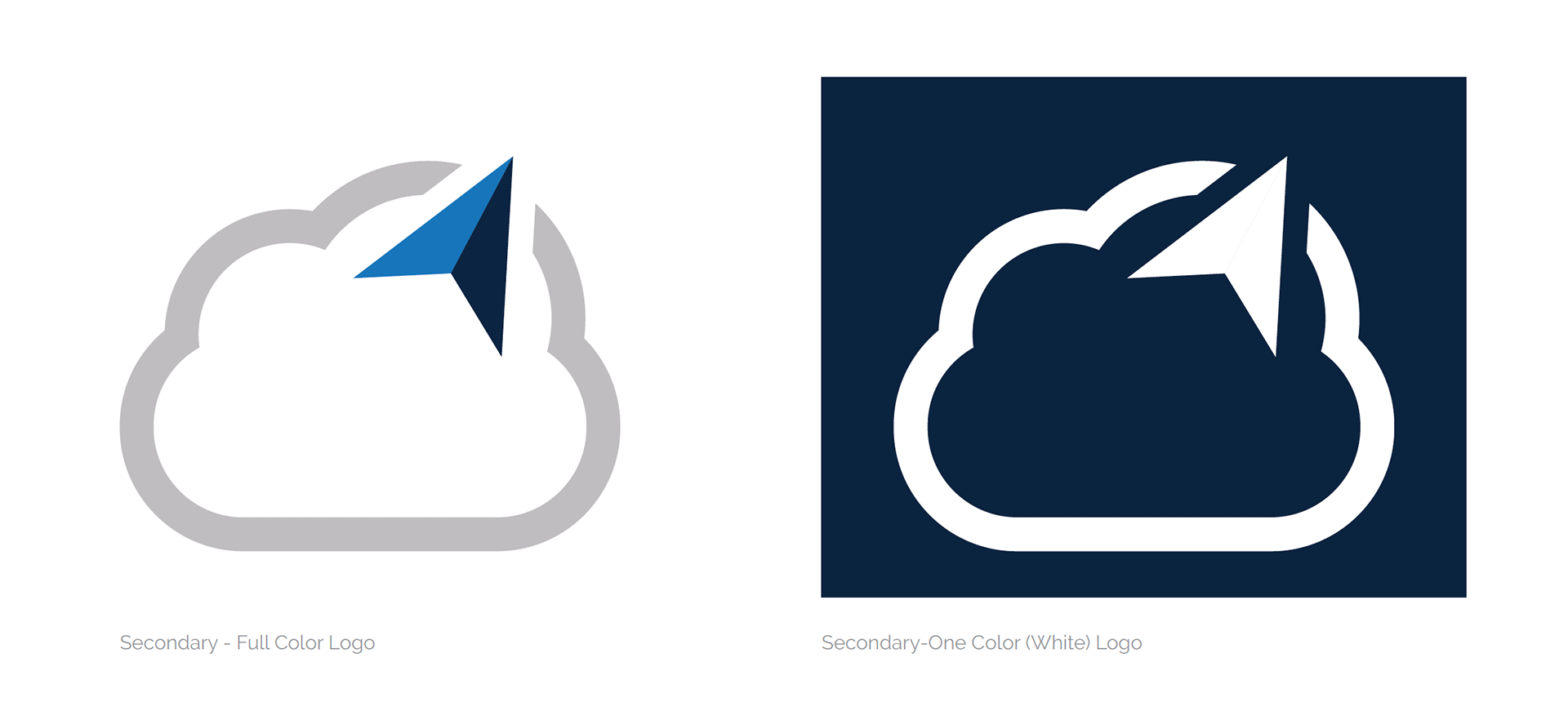
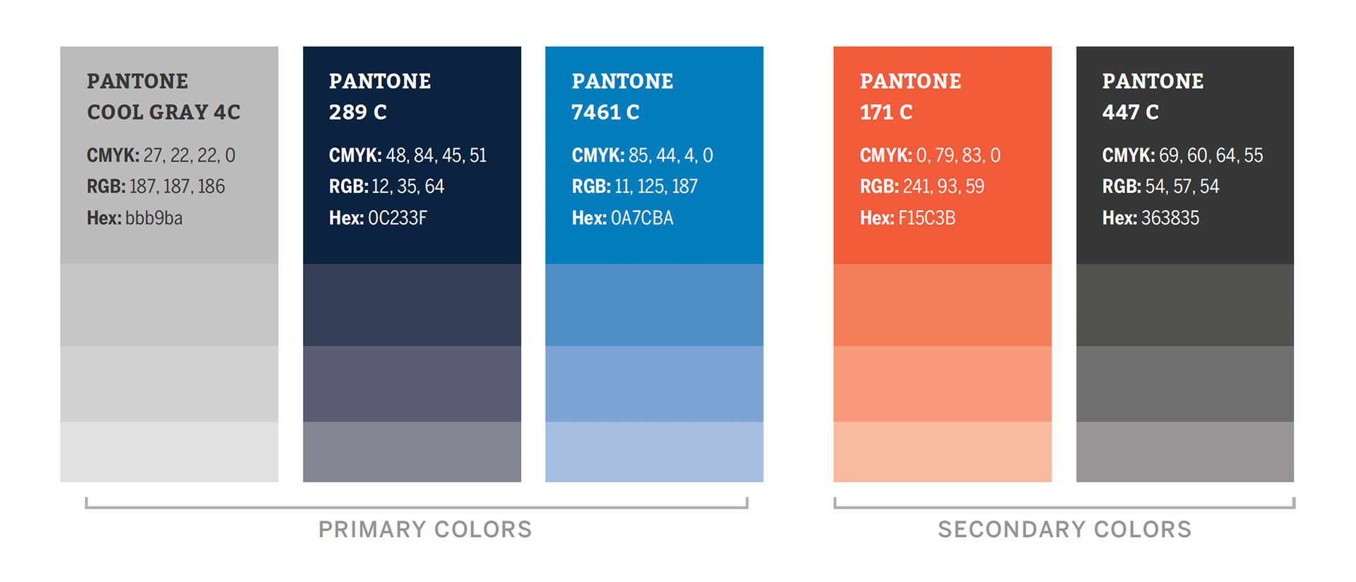
The client's vision for his company was to guide customers through the cloud of Platforms as a Service. Being a startup there was no history or previous branding to work from. I was able to create a brand from the ground up with the client that included a logo system, colors, fonts and brand standards.

Flex+ Footwear
Shoe Brand Concept
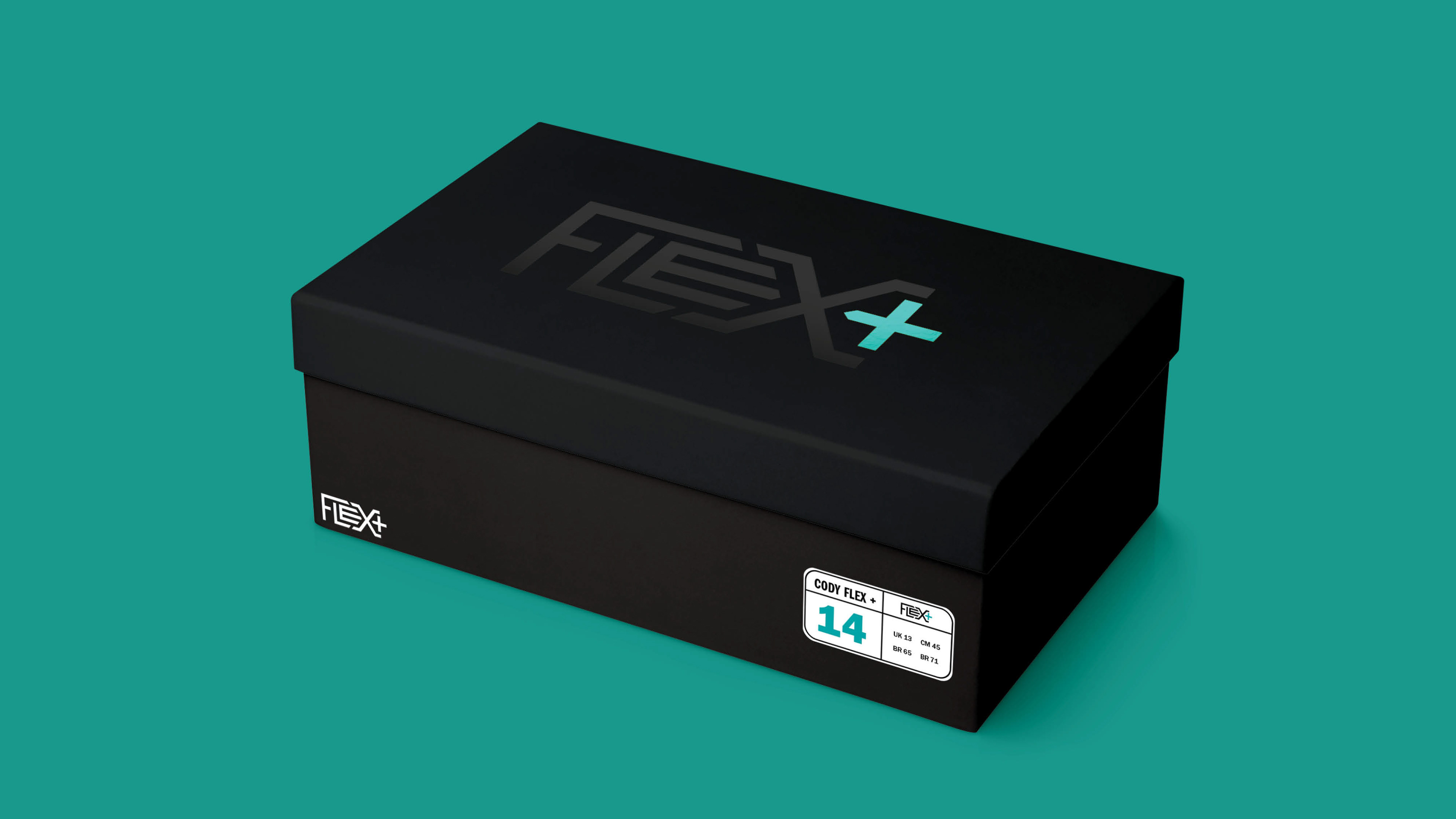
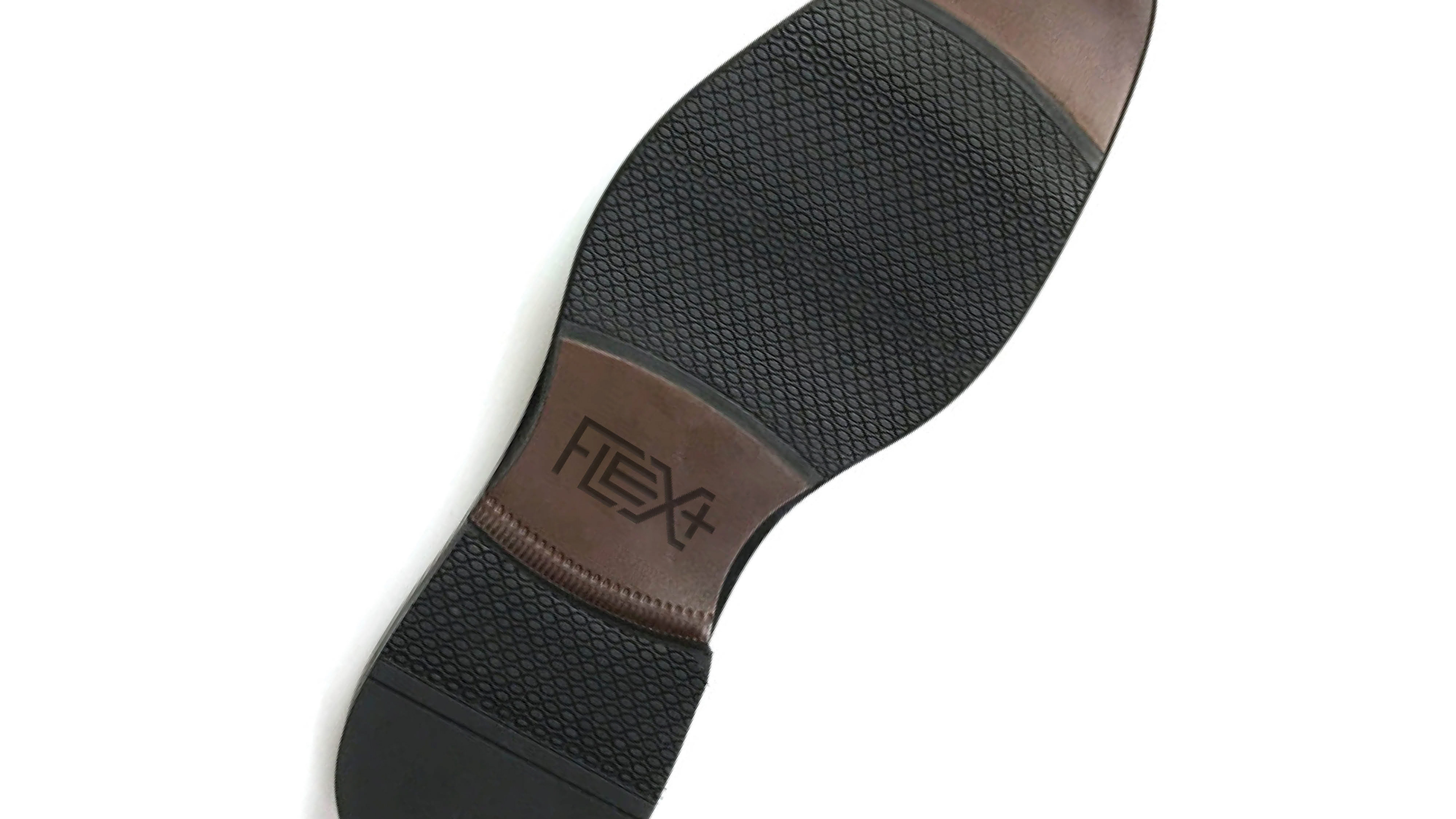
A well-known footwear company requested branding concepts for a new line of shoes. The goal was to create a mark with custom type that was crafted to tell the story of the shoe line. The shoe features an incredible flexible sole that brings a new level of comfort to dress shoes.
Nashville 615
The capitol of Tennessee and the place I call home. The 615 is a lovely place that is home to Music City. This design includes our area code in the shape of a music note and includes the Tri-Stars of Tennessee.
Granite Growth Health Partners
Growth Equity Firm
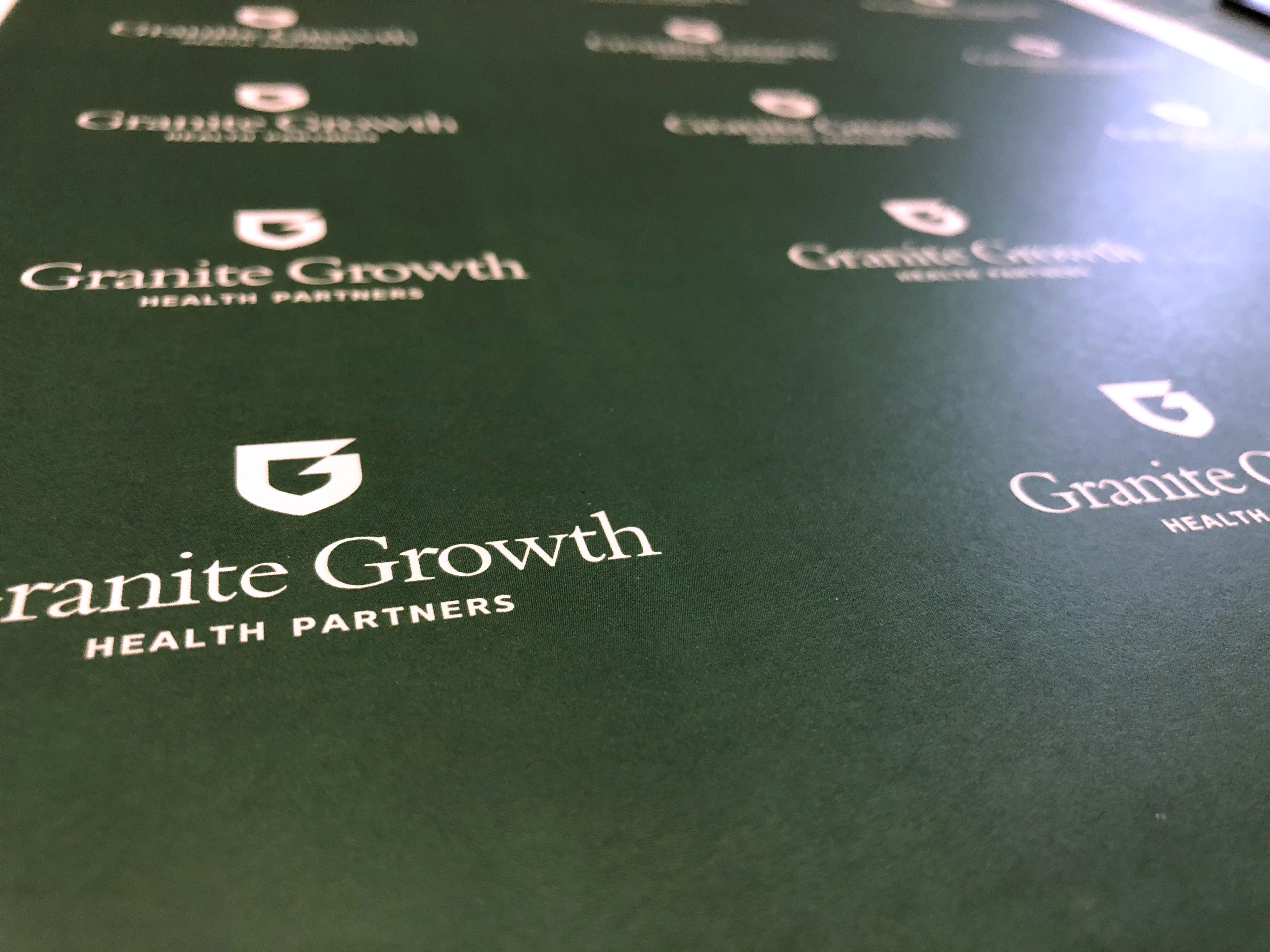
Firm wanted a mark that embodied strength and security. A G shaped shield in Dartmouth green with a second G in the negative space. Intersecting vertices at the close of the shield are equal angles that represent the partnership of the firm and its clients.
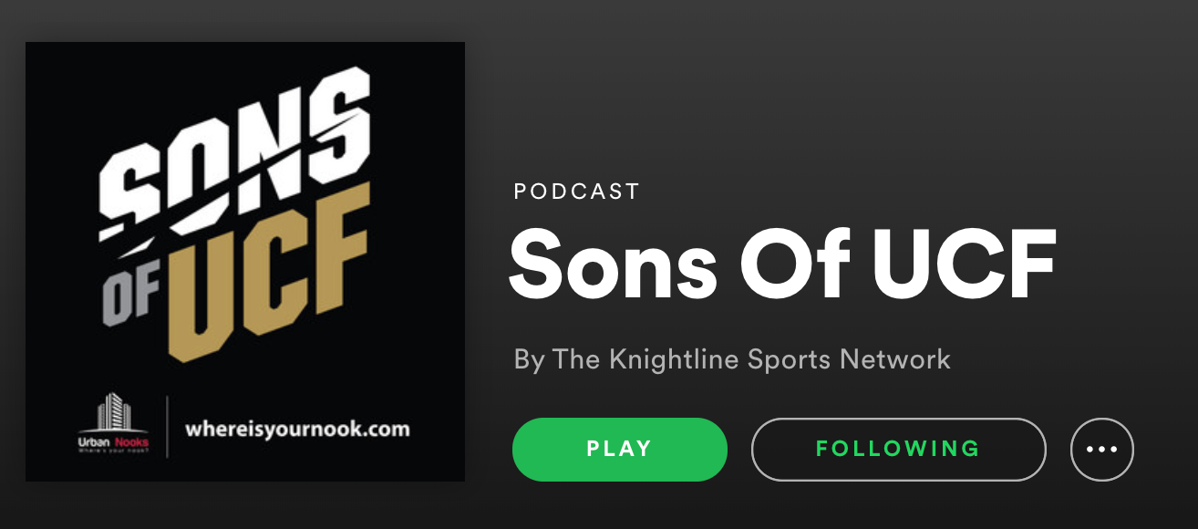
Sons of UCF
Podcast
A podcast covering sports for the University of Central Florida wanted a rebrand. Podcast logos live in small squares and need to be bold and recognizable. Using strong type at an upward angle cuts through the space and add action to the logo. The negative space in "SONS" is the lance from a throwback UCF logo.
HC3
The Health Care Council of Chicago (HC3) is an action-oriented collaborative that brings leaders from across the health care ecosystem together to solve our city’s most important health-related issues.
